
Hi, I am Ancy Cherian
I'm an editorial-focused graphic designer creating clean, structured layouts driven by typography and visual storytelling. I aim to create refined, publication-style layouts that feel intentional and professional.
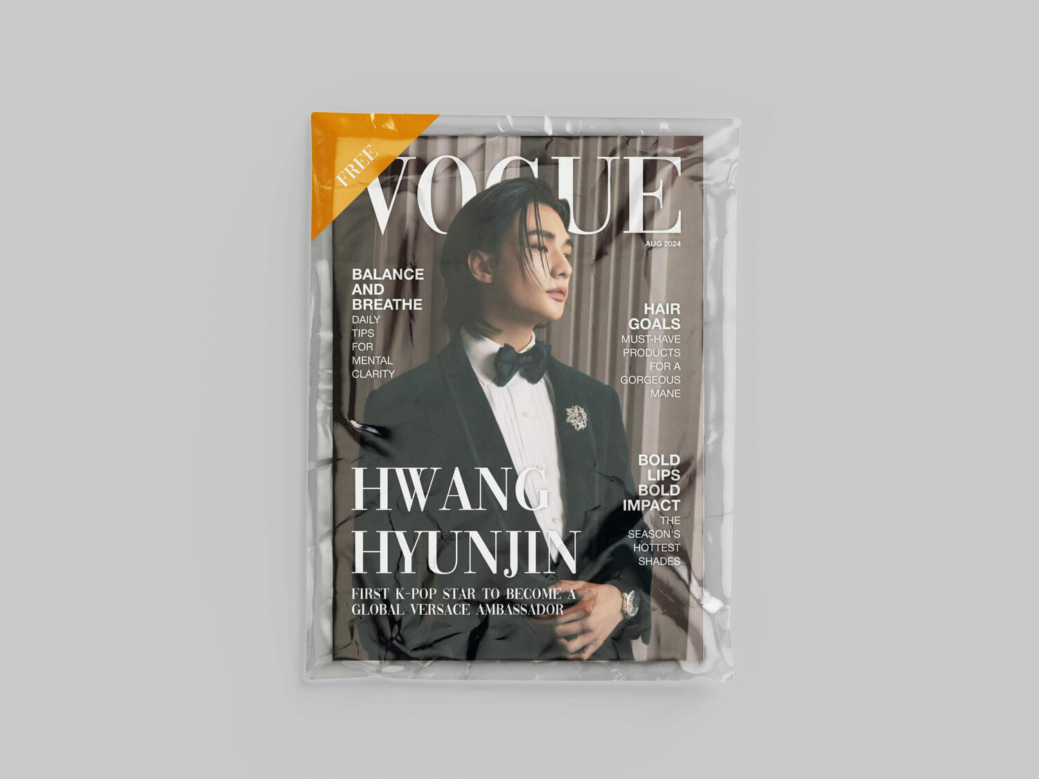
Vogue Editorial Concept: Hyunjin x Versace
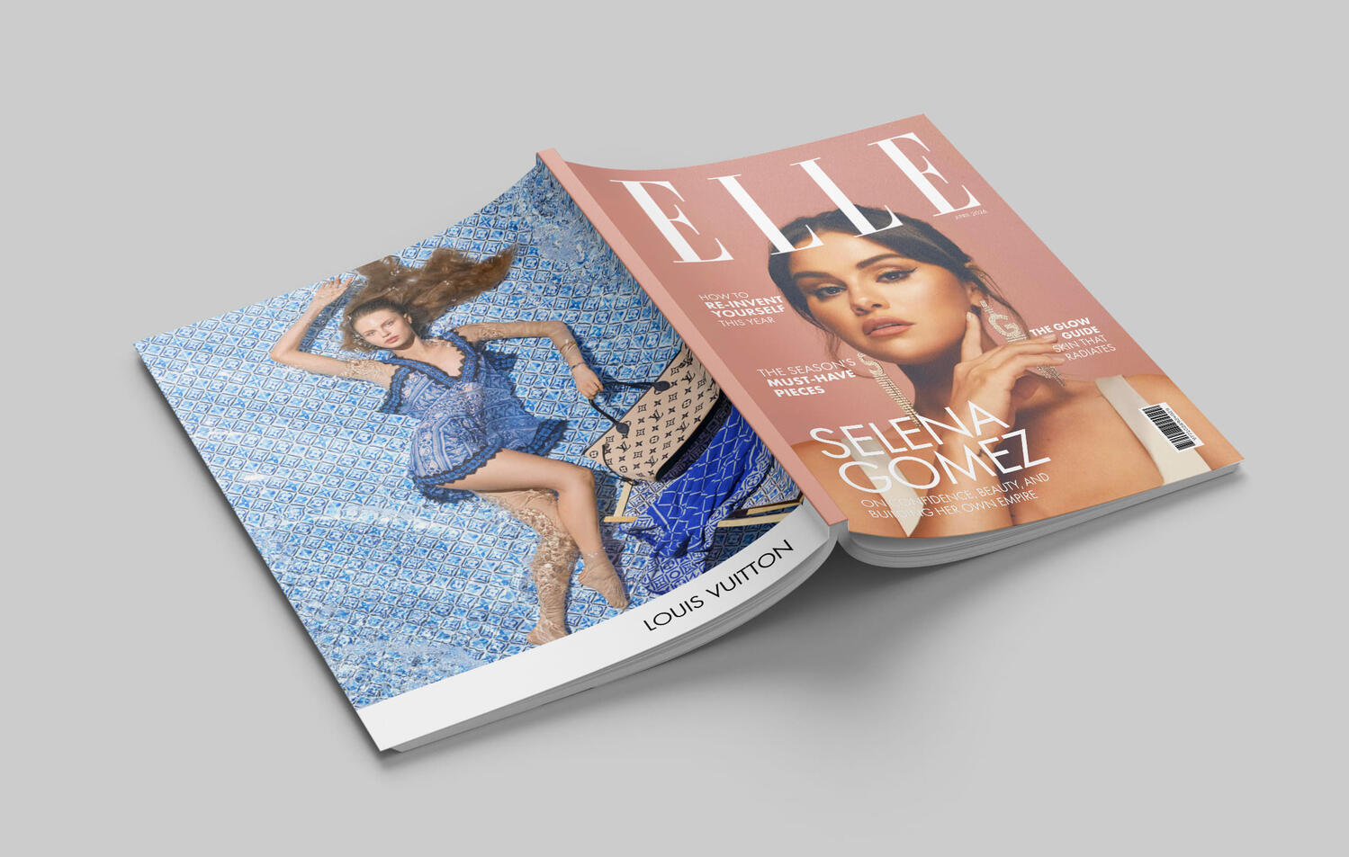
Beyond The Grid: Reimagining the Layout of ELLE
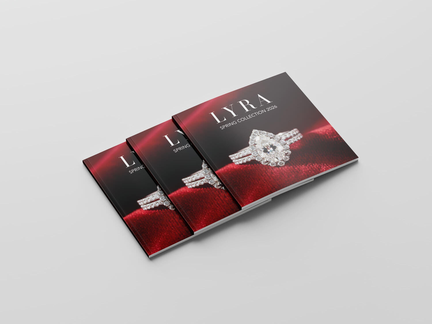
LYRA - Designing a Luxury Retail Publication
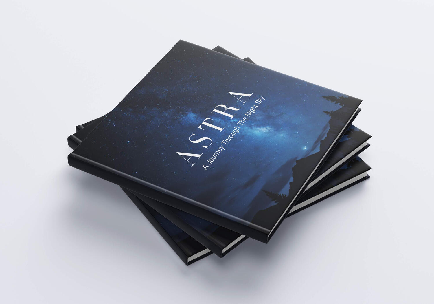
ASTRA: An Editorial Exploration of the Night Sky
Packaging Redesign | KORES Dustless White Chalk
Let's Work Together
Have a project in mind or need a creative eye for your next design? I'm always open to freelance opportunities, collaborations and exciting ideas. Feel free to reach out. I'd love to hear from you and bring your vision to life.
Vogue Editorial Concept: Hyunjin x Versace
Project Type: Editorial Layout / Creative Direction
Role: Graphic Designer & Art Director
Format: Self-Initiated Passion Project.
This project is an exploration into the high-fashion visual language of Vogue Magazine. Combining a sleek contemporary aesthetic with classic editorial design principles, this self-initiated concept features Stray Kids' Hwang Hyunjin.The goal was to meticulously replicate the sophisticated typography, spatial balance and striking presence that defines Vogue cover.
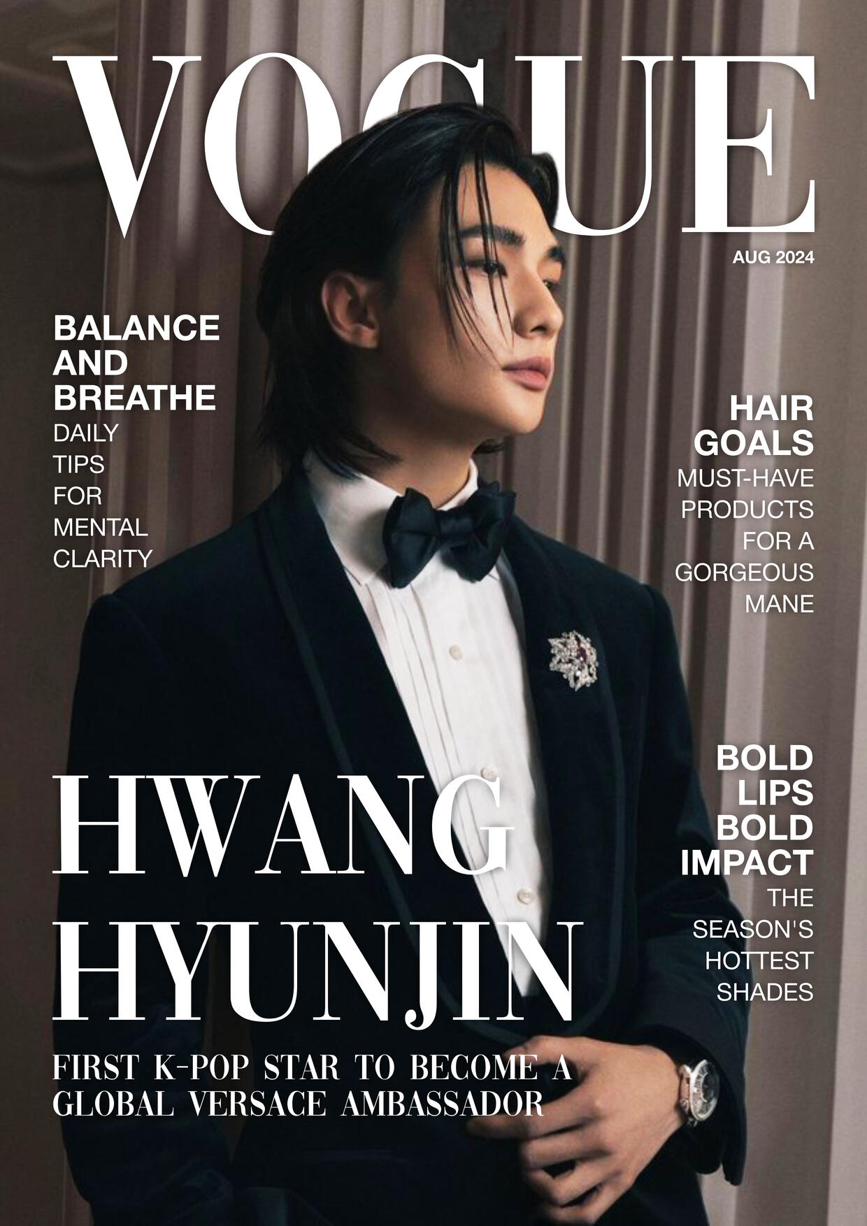


This project served as an incredible exercise in strict brand alignment and editorial constraints. By dissecting the DNA of a global fashion authority, I sharpened my skills in typographic hierarchy, layout balance and high-end photo integration.
(Disclaimer: This project is an entirely unofficial, non-commercial magazine layout recreation intended solely for educational and portfolio presentation purposes. VOGUE, its logo belong to their respective copyright holders. No copyright infringement is intended.)
Beyond The Grid: Reimagining the Layout of ELLE
Project Overview:This project is an unofficial editorial layout design recreation inspired by ELLE Magazine. The goal was to study high-fashion editorial aesthetics, focusing on typography, whitespace and visual pacing.
Role: Editorial & Graphic Design (Concept & Layout)
Project Type: Layout Recreation


To replicate the premium, luxury feel of ELLE, the layout uses generous whitespace, crisp editorial typography, and high impact fashion photography.Rather than relying on a rigid grid system, the layouts were crafted entirely by eye, prioritizing organic visual balance, intuitive alignment and a seamless flow between commercial advertisements and editorial content.


(Disclaimer: This project is an entirely unofficial, non-commercial editorial layout recreation intended solely for educational and portfolio presentation purposes. ELLE, its logo, and all featured brand assets (Prada, Gucci, Rare Beauty, L'Oréal, Bvlgari) belong to their respective copyright holders. No copyright infringement is intended.)
LYRA - Designing a Luxury Retail Publication
Project Type: Editorial Design / Lookbook
Format: Square Print Catalogue
LYRA Spring Collection 2026 is a self initiated editorial project created out of desire to explore modern luxury print design. The goal was to create a cohesive Spring seasonal catalogue that balances the visual storytelling of a high-end fashion magazine with clean, functional clarity of a retail product guide.Every design decision from the deep, dramatic color palette to the spacious text layouts was made to ensure the jewelry pieces remain the central focus.


Rather than confining the elements to a rigid grid system, the layouts throughout the catalogue were developed using intuitive optical alignment. By prioritizing negative space and visual weight over strict boundaries, each page achieves an organic breathing rhythm.


ASTRA: An Editorial Exploration of the Night Sky
Project Overview:ASTRA is a self-initiated high-end coffee table book created from my personal fascination towards astronomy and stargazing. It is designed to make complex astronomical data and cosmic imagery visually engaging for design enthusiasts and space lovers alike.
The Challenge:Design an image-heavy publication that balances high-contrast cosmic imagery with highly legible typographic layout without causing reader fatigue.
My Role:Art Direction & Editorial Design


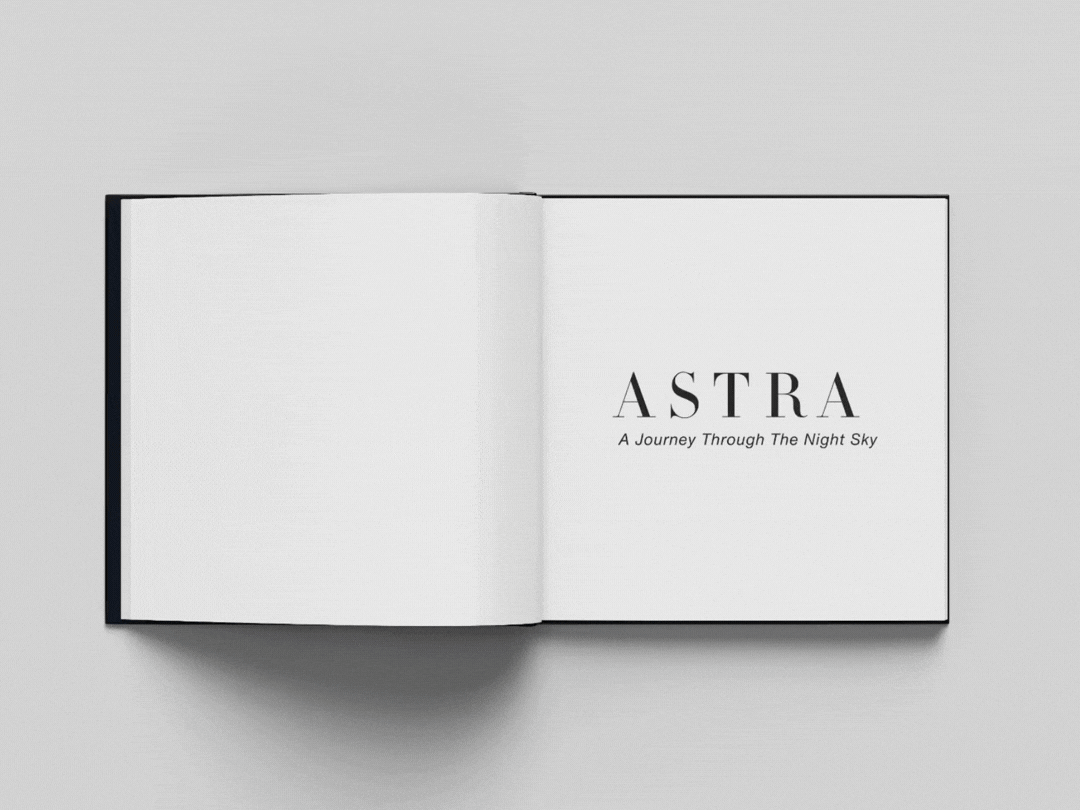
ASTRA was an immersive exercise in balancing the cosmic imagery with the editorial systems and grid discipline.
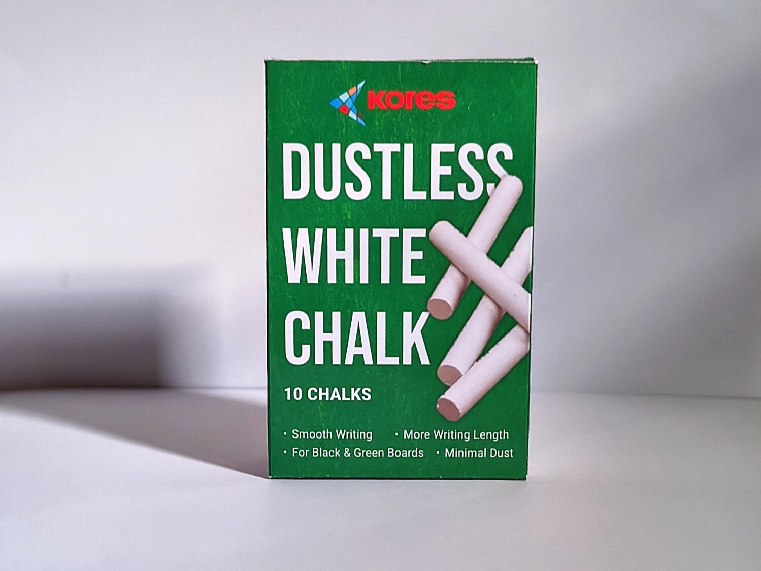
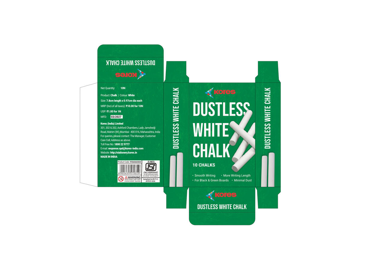
Packaging Redesign | KORES Dustless White Chalk
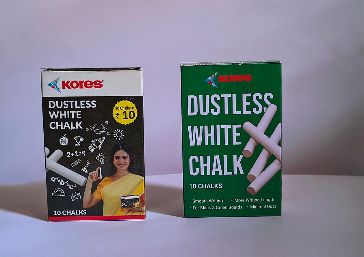
Project Overview:Kores is a well-known stationery brand recognized for its classroom essentials. This self-initiated project explores how the existing chalk packaging could be re-imagined with a cleaner visual language while maintaining the familiarity with the product.Rather than changing the product itself, the objective was to enhance communication through typography, hierarchy, and a simplified design system.
The Challenge:The existing packaging communicates a large amount of information through multiple illustrations, typography styles, and graphical elements.While visually energetic, the layout has several visual elements competing and busy layout, making the product name and key information to stand out immediately.
Objectives:* Modernize the overall appearance
* Improve visual hierarchy
* Increase shelf visibility
* Simplify information architecture
* Maintain the recognizable Kores identity
Design Strategy:The redesign follows a minimalist approach by allowing typography and product imagery to become the primary communication tools.The green color remains the dominant brand element while white typography reinforces the idea of cleanliness and dustless chalk.A subtle grunge texture was introduced to add visual depth without distracting from the product.
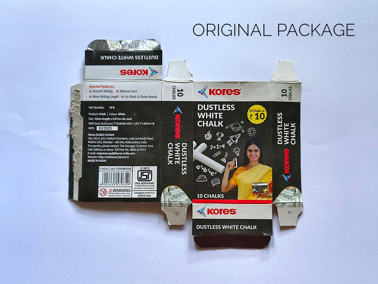
Dieline And Prototype Development:Instead of designing only a digital mockup, the packaging structure was recreated by studying and measuring the original box. A complete dieline was produced before assembling the physical prototype.
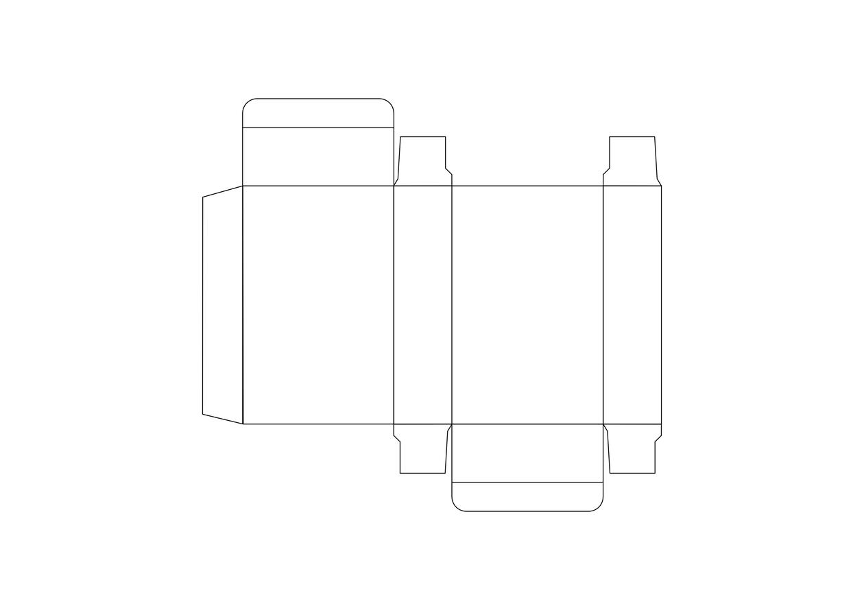


The design was printed, cut, folded and assembled using my home printing setup to test the structural design, layout and overall visual impact. Fine textures and certain color nuances may vary from a commercially printed version due to the limitation of consumer inkjet printer and paper stock.
Project Details:Software: Affinity
Package: Folding Carton
Prototype: Printed, Cut, Folded & Assembled by hand
Printing: Home Inkjet Printer
Paper: 200 GSM Kodak Premium Photo Paper